title

title

Monday 1 August 2011

A new piece


This is my most up todate image for my rebranding I quite like the clean asthetic to it and hope to work on it a bit more soon.

Thursday 10 March 2011

New Direction

As Iam having to restrict myself artistically as I am without camera for the foreseeable future. I feel I should keep myself busy I feel I should complete some of the pieces I have started recently they will be a step up from the posters I have worked on in the past. Less photoshop more pencils and pens.

Linkin Park Artwork

Hello peeps I am sat back listening to Linkin Parks Hybrid Theory album and got looking at the art work and thought I'd do a post about one of my favorite bands post the millennium.
When Linkin Park came into the public conscious the alternative scene was full of Nu-Metal and alot of the hideous rap rock that gave rise to bands as diverse as Korn (originators) Coal chamber (Goth metal) Limp Bizkit (plain rap rock) Spineshank ( Industrial rap rock) and Ill Nino (Latin rap rock) it was a pretty dire time as bands like Slayer Metallica and Megadeth had pretty much lost the interest of the masses. There were a few bands worth keeping an eye out for like Converge, Killswitch Engage and Linkin Park having been lumped in with the Nu Metal crowd this was mainly due to their use of electronica and their use of rapping in their songs.
What struck me most was the visual element of the band in 2000 when Hybrid Theory came out you could not go far to escape the striking art work of Mike Shinoda. It was everywhere posted up in shops pasted in the rock magazines one of the good things about being signed to a Major label like Warner Brothers.
In his own words "the band had looked through books for inspiration on how to present themselves for the first time". What they chose was a winged soldier this was a way to describe the bands blending of Hard rockier passages with their softer electronica elements. There were various designs of the soldier on the singles cd sleeves.
As a piece of design I thought it was striking and a pretty good introduction to the band.
Contained with in the pages of their sleeve was a mixture of screen printed visuals along with hand drawn elements set against photographic film strips.


Next up was Meteora
The art work here was mostly photography based. A graffiti artist at work on a piece, here i liked the clean aesthetic of the layout and design it is hard to fault it really what I was originally looking for from the work was a bit more graphic in its execution. What I mean here is that on the Hybrid Theory art work there were hand drawn elements along with the screen printed visual.


Saturday 26 February 2011

Artist: The work of Mark Romanek

Of all the music video directors working in the 90s from Spike Jonze to Jonathan Glazer the music videos of Mark Romanek Stood out most. I did not know it at the time as that kind of information was not or rarely included when you watched a video on TV. In the early 00s when I was in university researching the videos of Nine Inch Nails for an essay on music and music videos that I came across the works of Mark Romanek. It was fascinating how many iconic 90s music videos he had worked on including Nine inch nail's Iconic Closer video and Johnny Cash's cover of "Hurt".
I'd recommend the dvd The work of Director Mark Romanek to any aspiring photographer as well as any aspiring film maker.
as the dvd is now a good 6 years old you should be able to pick it up for a tidy sum.


Sunday 20 February 2011

Some Cool Painted VHS Covers (Why dont more companys use this anymore?)

Following on from my Booby trap Find I thought why not revisit some old VHS box covers and a recent DVD cover.
I have chosen a selection of covers that made me drool in the video store but could never get them due to being about 6 at the time.


First up is Return of the Living dead which I feel is officially the coolest VHS cover ever its loud and very bold much like the movie a major plus is that it is one of my fave horror movies ever.


Nekromantik how can you not fall in love with an image of a corpse and a naked woman plainly said this movie was a lot different from the cover suggested . Yes it features a woman having sex with a corpse and the story features Necrophilia but its shoot in such a beautiful way that you could forgive it for being this way


They sure dont make action movies like this anymore and its a shame as the cover conveys the movie pretty well and its my fave from the Bronx Warriors trilogy


Cannibal Ferox this cover is different from the reissued Vipco release this cover surpasses the movie in the coolness factor I love exclaimer about the movie being disturbing its not really that disturbing but a great entry in to the cannibal genre all the same.


Hide and shriek this was my first taste of how the art made the movie seem better than it was and man was it cheesey

Booby trap

Having had a great idea recently I was looking in the loft for VHS cover gems and I feel this movie took its pie and ate it... literally. It was made in a time when we were very close to nuclear bombs dropping every where "Wired To Kill" or "Booby Trap" (I'm not sure why they chose to give it a name that made you think it was an adult sci fi movie or sex comedy is beyond me.) as it was known here is a pretty effective science fiction/ horror hybrid genre movie with a cast of unknowns you were plunged in to a world where we are living in a post apocalyptic world where street gangs cause havoc with brutal outcomes. The story here centers on a couple who on one fateful night are attacked by a street gang where they rape his girlfriend and break his legs in a horrific scene. from here on out we see the couple exact their revenge in a truly 80s style its violent and has a grim atmosphere with a haunting ending.
The VHS cover is the one supplied to the UK it had an odd silvery ink used so when scanned looks bit odd.


Saturday 19 February 2011

Florian Bertmer

Having come across Forian Bertmers work only recently when I picked up some Agoraphobic Nosebleed compilations and albums I was intrigued by his work the mixture of Art Nouveau style visuals along with surrealist imagery has left my jaw hitting the floor on a few occasions. Here are some examples of his work I could find on the net.


Monday 7 February 2011

Cow photo

You know spring is on its way when you see animals everywhere in the fields by the road ect Its a given. I went for a walk today to find a place to take some photos when I came across a sign reading Electric fence I thought oh oh hopefully i wont get buzzed. I got a shock to see these cows just munching away on the grass. here is a shot from my travels today.


Jacob Bannon

While I'm on the subject of people whose work I admire once seen you can easily identify his work as it has been imitated more times than I can remember. His use of screen print and paint splatter has made his work have a raw feel to them that few artists can achieve.
Here is a small selection of his work.


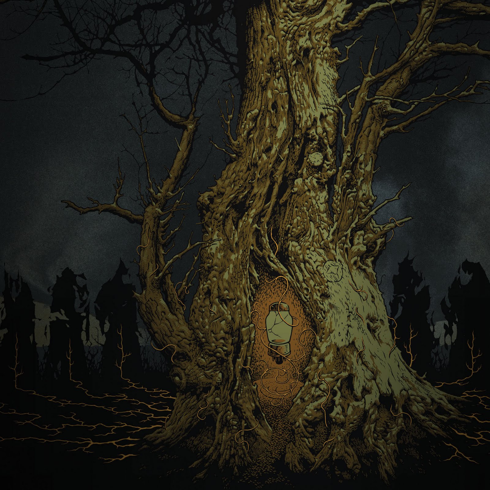
http://jacobbannon.com/
http://www.convergecult.com/

Aaron Horkey

In a nutshell Aaron Horkey's work is Mesmerizing, the detail of all of his work is astounding you could look at it and just wonder where he would start a piece. His work will inspire my next set of posters so i can work on my pen and ink style a lot better than it is.
Here are a few select pieces I have found for your viewing enjoyment.


Friday 4 February 2011

Final flyer image.

The end is here for another project and having tweeked the flyer design here is my final design for it.


Fate Untold Saul bass inspired leaflet.

Having had a shorter than usual deadline for my latest leaflet I was given 2 days to work this out I got to work and found I was inspired by Saul bass. The whole pop art look to his work prompted me to work creatively and quickly. here is a selection of looks I worked with before handing me my final piece. Hope you enjoy them as much as I did making them.